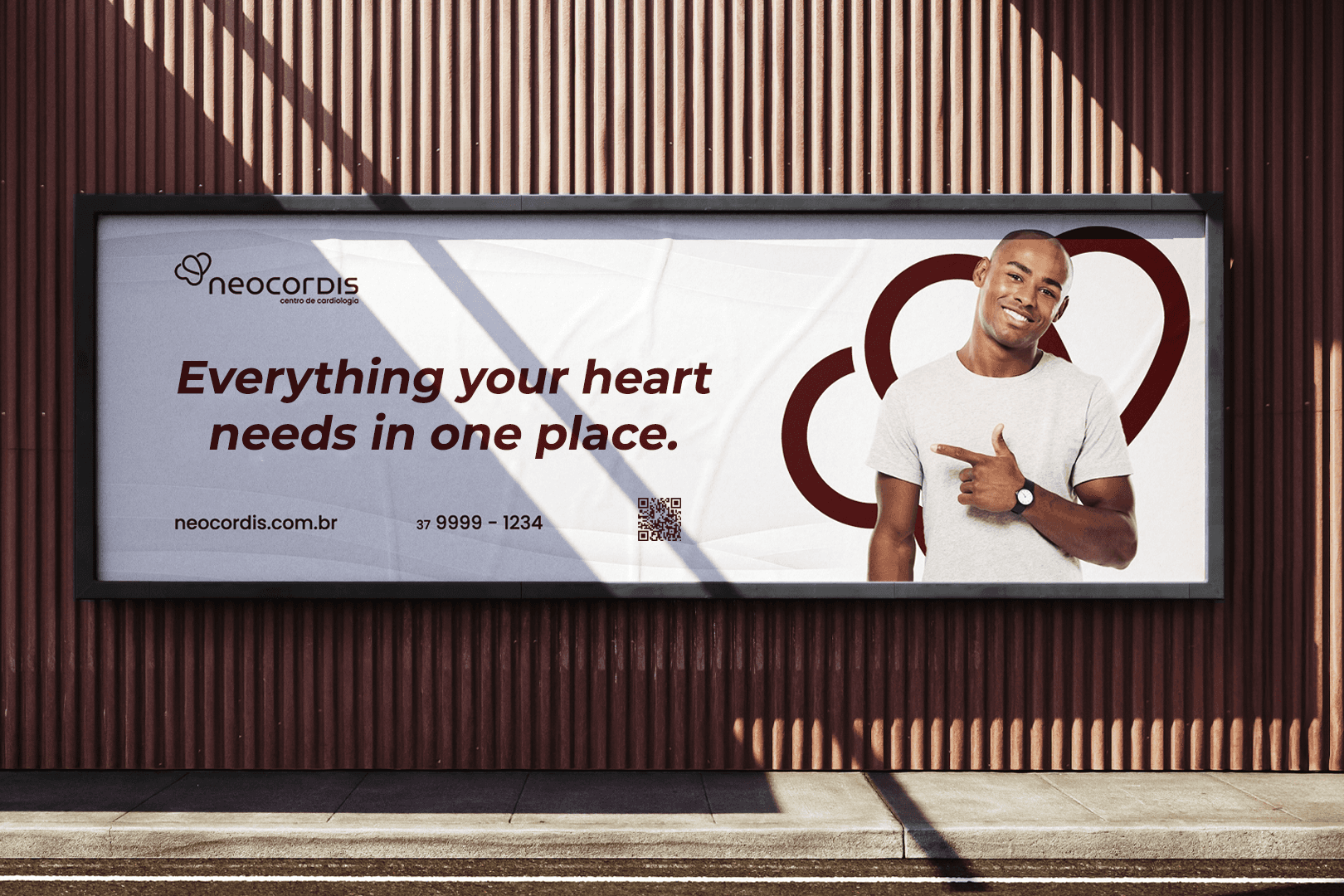
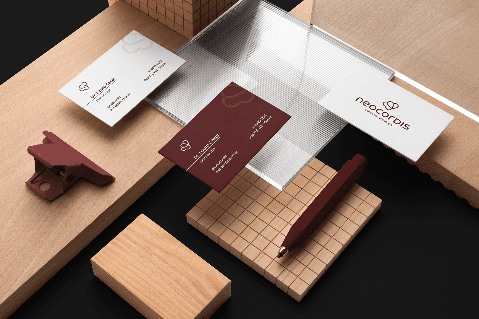
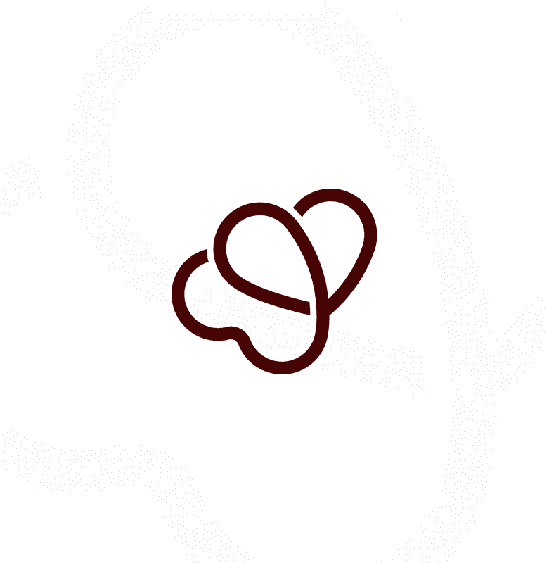
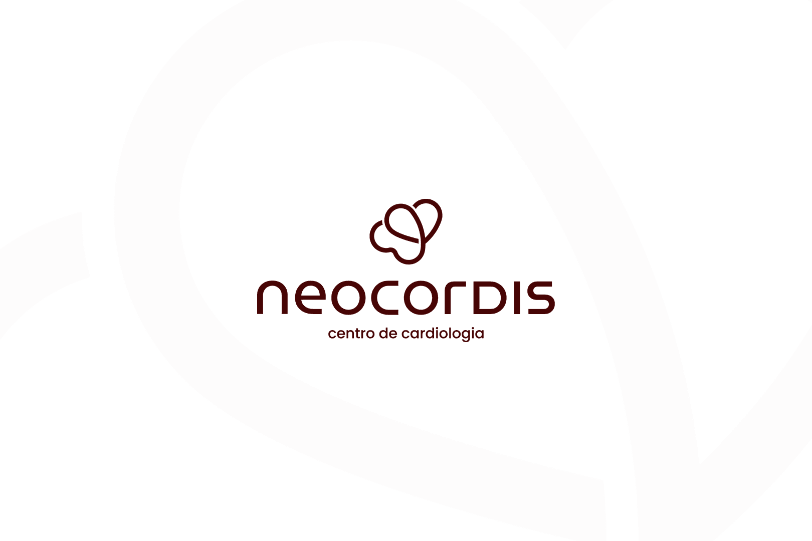
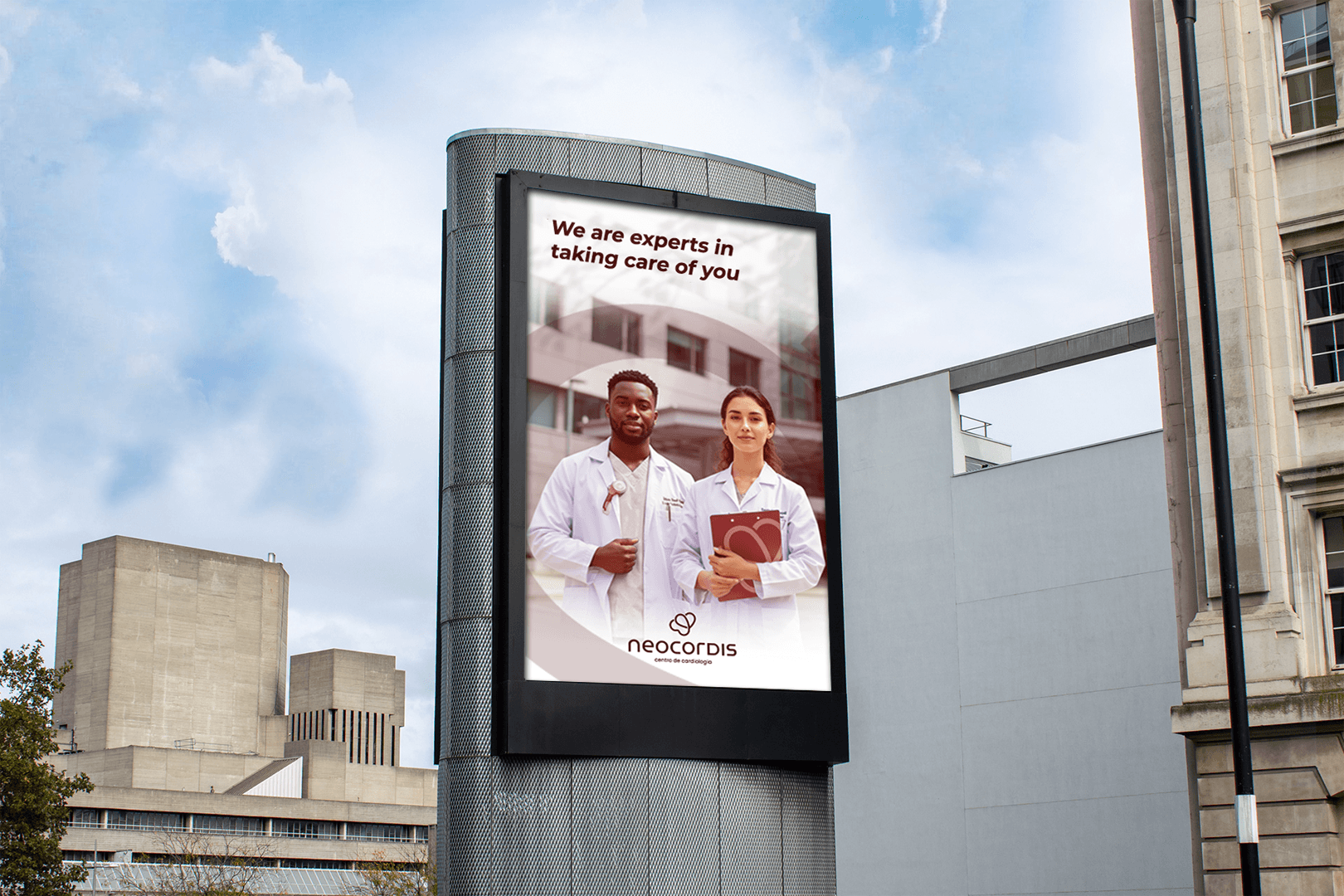
This visual identity was designed to redefine how cardiology is represented, moving away from clichés and embracing a more thoughtful, symbolic approach. Rather than relying on literal icons like electrocardiogram lines or heart shapes, the concept delicately blends the silhouette of a heart with the elegance of a butterfly. This fusion not only suggests life and transformation but also reflects the values of care, precision, and human connection that are essential to cardiac health. The result is a brand identity that feels refined, empathetic, and unmistakably unique.

Minas Gerais, Brazil
2006
Health
40+
Challenge
The primary challenge was to develop a visual identity that clearly communicates the company’s focus on cardiology while steering clear of clichés such as electrocardiogram lines or typical heart symbols. It was essential to create a mark that stands out as both professional and unique, conveying the values of life, care, and attention inherent to cardiac treatment. Balancing medical precision with emotional warmth, the brand needed to resonate with both healthcare professionals and patients, fostering trust without feeling clinical or impersonal. This required a thoughtful approach to symbolism and design to ensure the brand felt distinctive, approachable, and meaningful.
Concept
The concept centers on combining two powerful symbols: the heart and the butterfly. The heart silhouette represents the core focus on cardiology and life itself, while the butterfly adds a layer of meaning—symbolizing transformation, care, and delicate attention. This fusion creates a unique and subtle visual narrative that embodies both medical expertise and compassionate care. The design avoids typical, overused imagery and instead offers a fresh, elegant representation of the company’s mission to nurture and support cardiac health with precision and empathy.
"The branding perfectly captures our mission with a unique and meaningful design. The heart and butterfly elements balance clinical precision and compassion beautifully. The process was smooth, communication clear, and the final identity resonates well with our audience."

Lauro Cesar
Cardiologist & Founder | @clinicaneocordis

Process
1. Discovery & Research
The journey began with a thorough exploration of the brand’s core mission: providing compassionate, expert cardiac care. Through detailed discussions with the client and a study of cardiology industry standards, we uncovered the need for a distinctive identity that would stand apart from common medical clichés. Understanding the emotional gravity of heart health shaped the foundation for a sensitive and meaningful design approach.
2. Concept Development
Guided by the insights gathered, we developed a concept that harmonizes science and compassion through symbolism. The heart silhouette anchors the design in cardiology, while the butterfly introduces themes of life, transformation, and gentle care. This blend aimed to communicate a brand that is both clinically reliable and deeply human.
3. Symbol Design
The resulting logo merges the heart and butterfly into a unified, elegant mark. Avoiding literal or overused motifs, the design uses subtle curves and balanced forms to evoke both vitality and delicacy. The icon conveys a sense of hope and attentiveness, embodying the brand’s commitment to life-saving treatments delivered with empathy and precision. This identity offers a fresh, memorable symbol that speaks directly to patients and professionals alike.

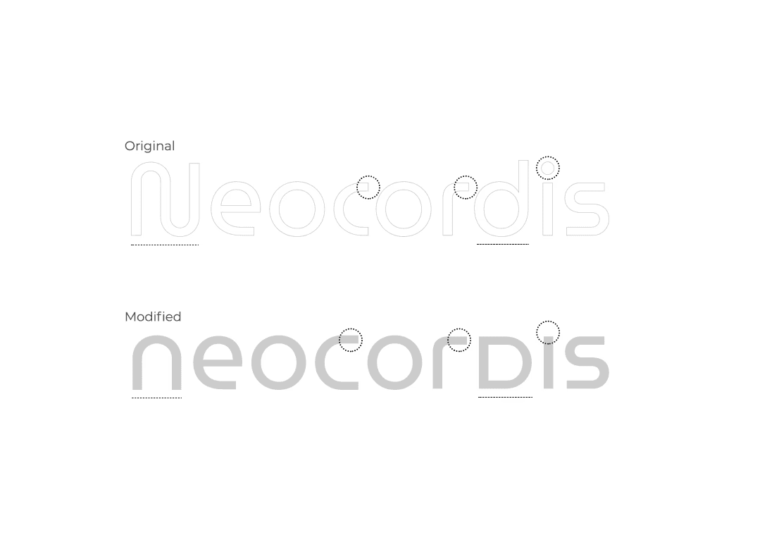
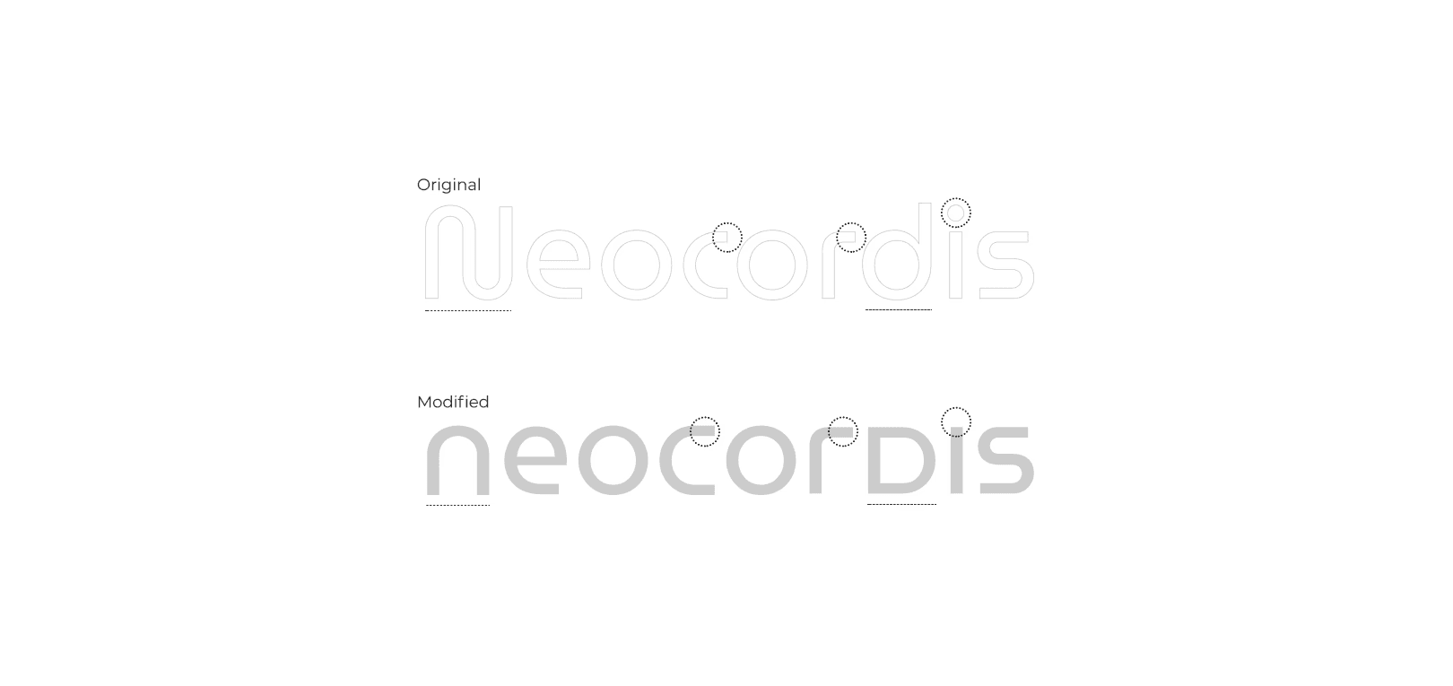
Typography
The typography, designed exclusively for this project, is composed of soft, modern curves, providing a light yet solid aesthetic, aligned with the clinic's principles of trust and innovation. The combination of these elements uniquely conveys the essence of the brand, highlighting its proposal for care and excellence in cardiology care.

Outcome
The design avoids typical, overused imagery and instead offers a fresh, elegant representation of the company’s mission to nurture and support cardiac health with precision and empathy. By combining the symbolism of a heart and the humans, the design communicates care, life, and attentiveness, effectively connecting with both medical professionals and patients. The result is a refined, memorable identity that supports the company’s mission and values.