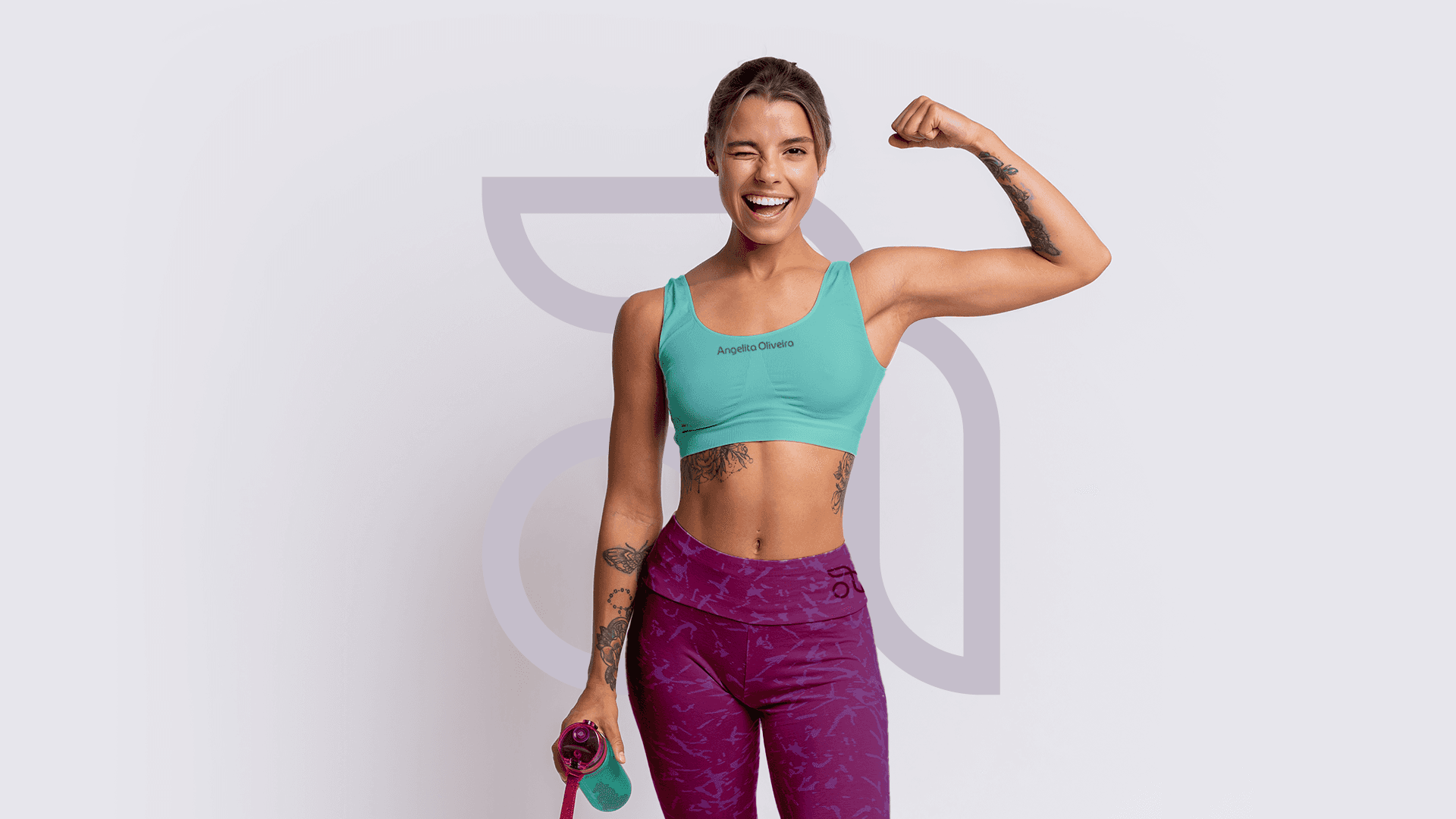
Designed to unite rehabilitation and physical education, this brand balances scientific precision with human connection. It speaks to both professionals and clients through a visual identity that embodies strength, motion, and recovery.

Minas Gerais, Brazil
2023
Wellness
Individual
Challenge
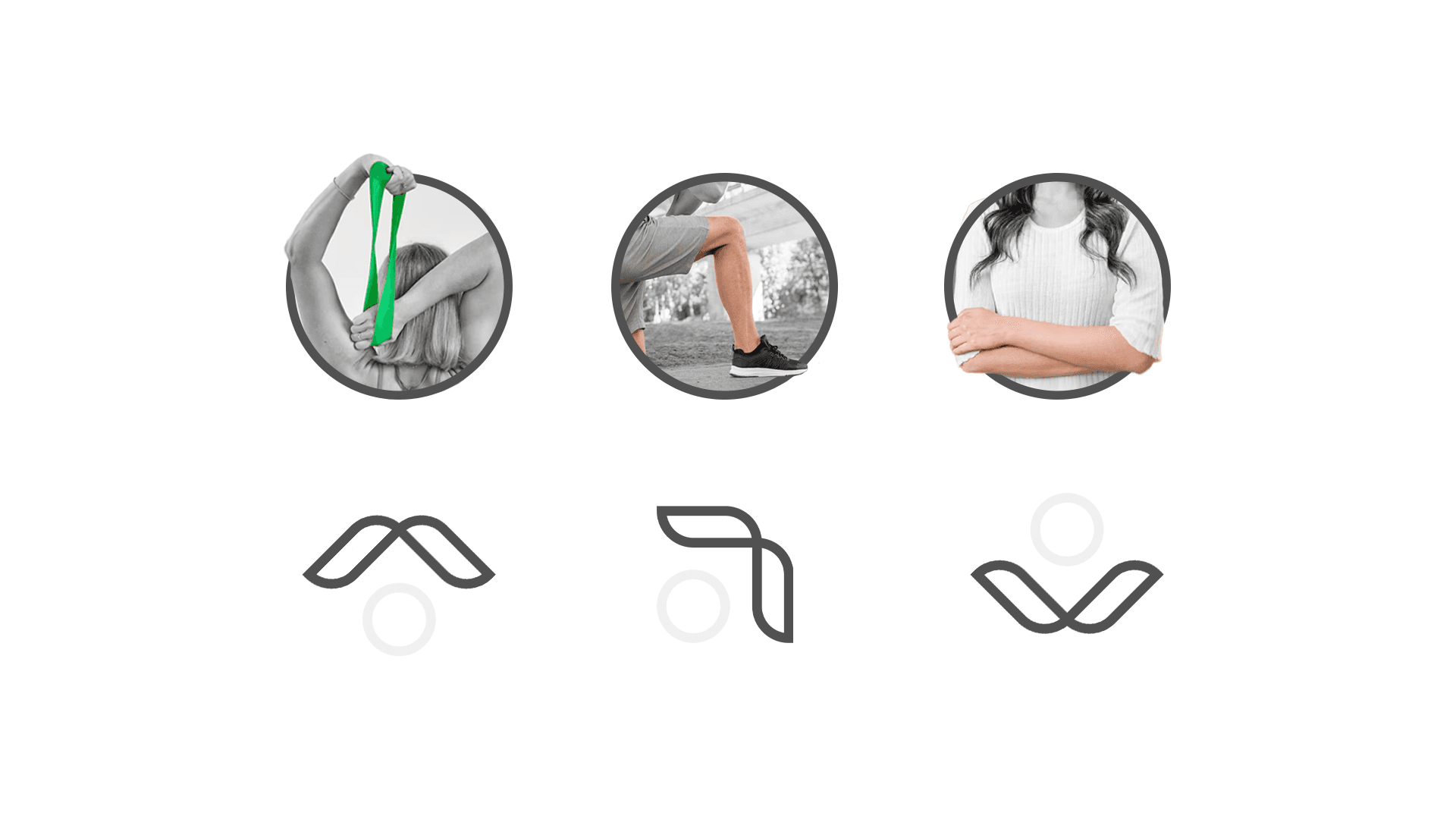
Designing a brand that bridges the worlds of rehabilitation and physical education demanded a nuanced approach. The core challenge was to develop a visual identity that communicated trust and expertise to both medical professionals and fitness clients, without compromising clarity, credibility, or emotional connection. The goal: create a brand that feels both clinical and human, young yet approachable.
Results
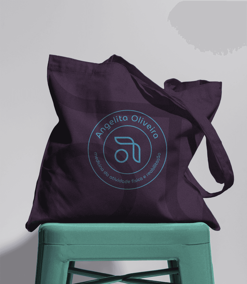
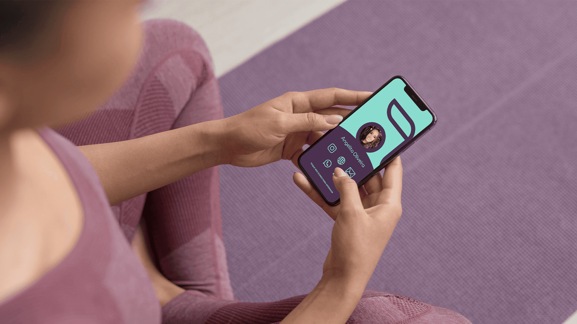
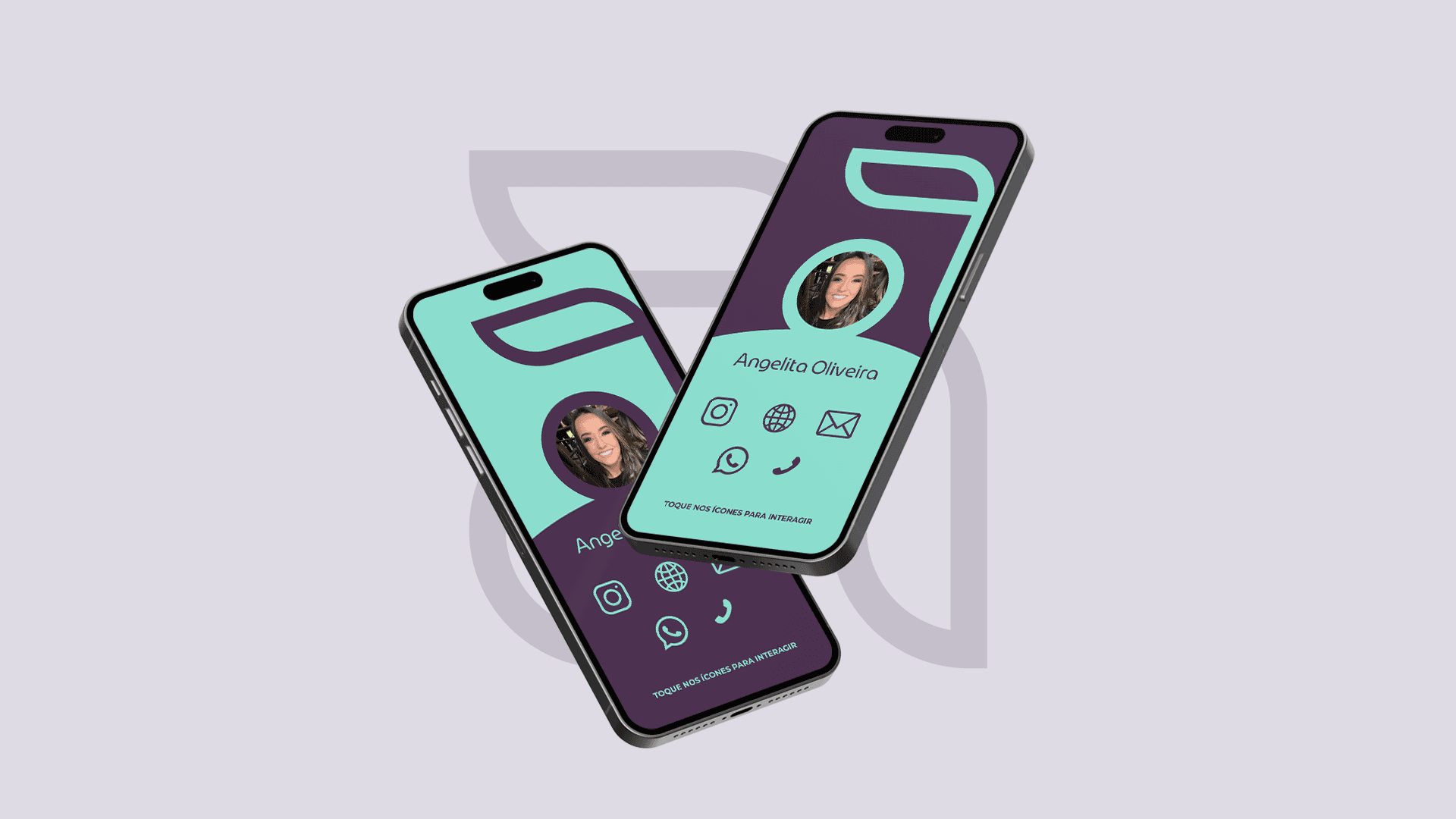
The new brand identity successfully bridges the gap between rehabilitation and fitness, resonating with both health professionals and their clients. The versatile logo system has been applied across digital platforms, signage, and branded materials, enhancing brand recognition and trust. Its thoughtful symbolism has sparked positive feedback, strengthening the brand’s positioning as a modern, science-driven, and client-focused practice.

"Working with Felipe was such a smooth and inspiring experience. He truly understood the heart of our brand and translated it into a visual identity that feels both professional and personal. We loved how the logo tells a story and connects so naturally with what we do. Every detail was thoughtful and aligned with our values. Thank you for helping us see ourselves in a whole new light!"
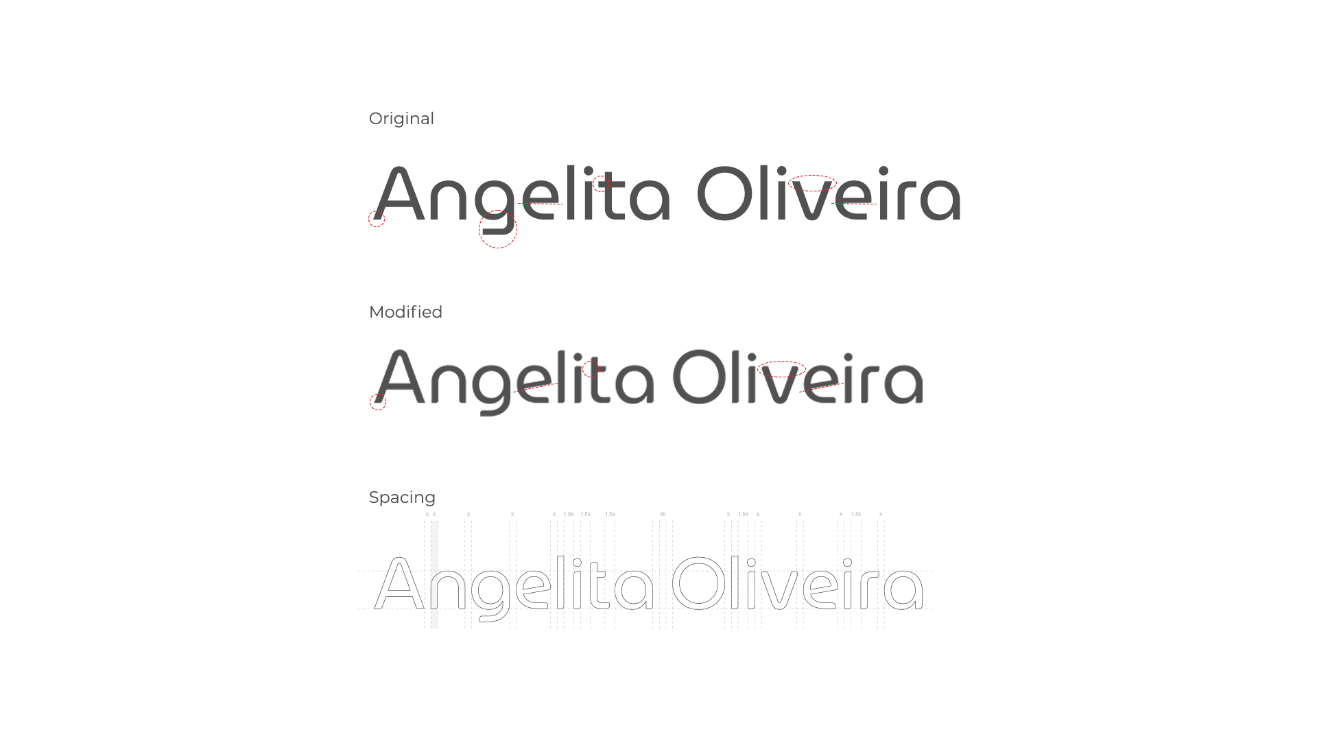
Angelita Oliveira
Founder

Outcome
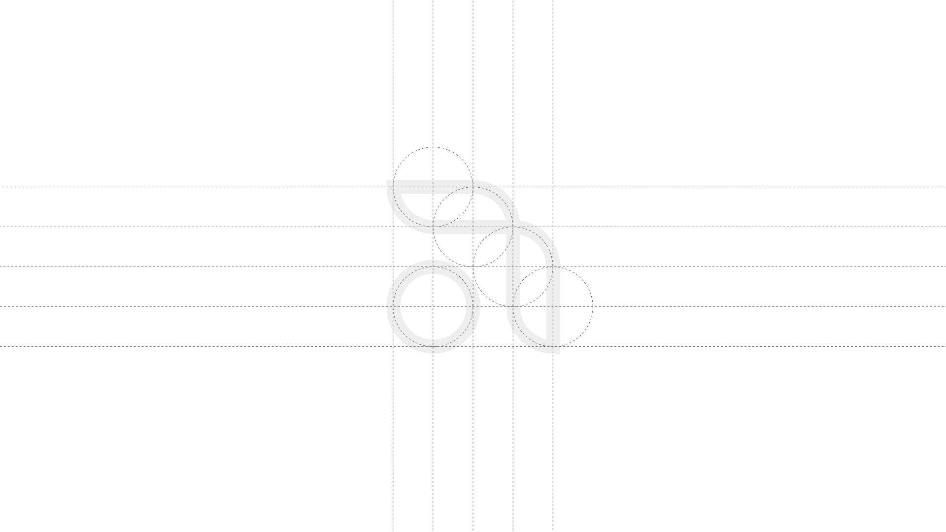
The final brand identity strikes a powerful balance between science and movement, creating a visual language that feels both precise and human. By uniting elements of rehabilitation and physical education into one cohesive mark, the brand communicates trust, strength, and progress. The result is an identity that resonates with professionals and clients alike: versatile enough for clinical settings, yet approachable and inspiring for those on a journey to recovery. A brand that doesn’t just stand for wellness, but moves with purpose.